A minor hobby – and probably a minor hobby of most conversion rate optimizers – is to look at sites and think about what works on the site and what doesn’t.
Peruvian Connection caught my eye because it raised a question: What is the best testing strategy for a page which has multiple serious problems?
Caveat
Until you test a site, you don’t know if changes are going to help. And I don’t have data about Peruvian Connection’s audience. So the changes I identify are best guesses.
As this is an example, I’m going to focus on non-sale product pages on desktop. If I was testing the site, there are other variations that would have to be taken into account.
The Product Page
A Peruvian Connection product page:
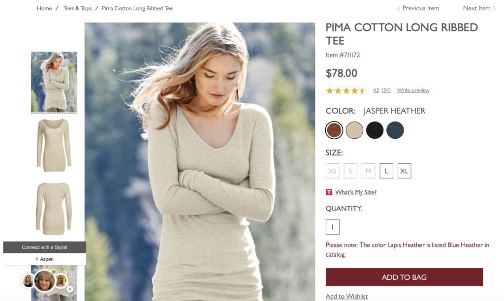
There are multiple issues with this page.
A few areas that jump out at me:
- Text Layout
- Mouseovers
- Chat box
Text Layout
This image shows part of a Peruvian Connection page and the corresponding elements on an Eddie Bauer page:
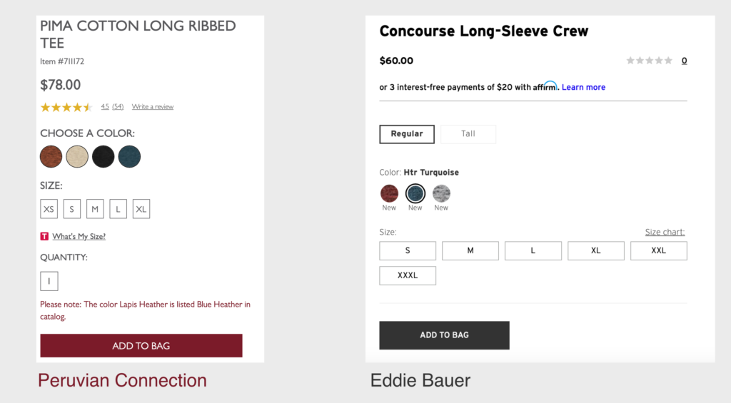
Note: I’m not arguing that Eddie Bauer has the perfect page, rather that the layout is better.
On the Eddie Bauer page, there is space between each section so the sections don’t run together. On the Peruvian Connection page, the sections have very little space between them so the page feels claustrophobic.
Eddie Bauer does a better job of emphasizing only some of the information. To take one example from many, the word Size is smaller and lighter on the Eddie Bauer page compared to the other content on the page. This makes sense as most users will understand that S, M, L, etc refer to sizes so the label can be understated. In contrast, on the Peruvian Connection page, the word Size is much more noticeable.
On the Eddie Bauer page, the eye catches on the major decision points, e.g. the color, the size, and the add to bag button. This creates a clear path for the eye to follow. On the Peruvian Connection page, there isn’t a clear path so it’s hard to know where to focus.
Better presented information reduces the cognitive load of the page. It is more obvious to users what they should focus on and what they can overlook.
A page with a better text layout could increase conversions as users would be more focused on the product rather than being distracted by unnecessary detail.
Mouseovers
If you mouse over the product image, a zoomed in square pops up. Mousing over the colors causes the image to change. Mousing over the images on the right causes the image to change. Mousing over the review rating triggers more information to appear.
I’ve highlighted the elements that cause the page to change when moused over:
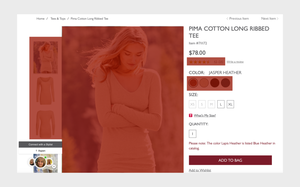
It’s hard to move around the page without inadvertently causing something to change, which is very distracting. Humans naturally focus on movement.
Reducing the amount of unintended movement is likely to help because the user won’t be constantly distracted from what they are interested in, which is looking at the product and making a purchase decision.
Chat Box
The chat box in the lower left covers up essential UX functionality.
Under the chat box, there is an arrow that users click on to see additional images. Since the arrow is covered by the chat box, users have three choices:
- They can not view all the images. Users may not even realize they’re missing some images.
- They can scroll down, flip to the next image, and then scroll back up again. This is annoying for the user as it interrupts their task – they have to scroll down and then re-center the page before they can look at the product images.
- Or, if they spot it, they can close the chat. This is probably the most user friendly solution but it’s not obvious that the chat box can be closed.
Testing Strategy
These testing approaches assume that all product pages would be tested at the same time.
Individual Elements
You could test individual elements in a series of A/B tests. An example of an individual element would be how users interact with the color change selection, e.g. users click on the colors rather than mouse over them to change the color.
This approach – a single change at a time – is precise. In theory, you can measure the impact of a single change.
However, the Peruvian Connection product page has a lot of issues and clearing up one issue at a time might not be enough to give you a strong signal.
Imagine running through a field and having to jump over 10 logs. Removing one log is great but the remaining nine logs are still in the way and will stop you from getting to the other side of the field. The only way to have a clear run is to remove all or almost all of the logs.
To carry through on the analogy, this page has a lot of issues that trip users up. Removing one issue might not make a big difference. Instead, a lot of connected changes need to be made so users find it easier to make a purchase.
Multivariate
A multivariate test might be a good solution as you could test multiple elements. Using multivariate testing, you find a combination of changes that drive higher conversions.
Multivariate tests typically take longer to run.
If you decided on a multivariate test for this page, you could test groups of changes to cut down on testing time and to give the user a more coherent experience. For example, instead of testing each mouseover as a separate variation, you might replace all mouseovers with a click and treat that as one variation.
Product Page Redesign
If you want to replace the page with an entirely new version, you could test a redesign of the product page.
It’s more risky to test a redesigned page because multiple variables are introduced. You could make 10 changes, five of which help and the other five depress your results.
But if there are too many issues with an existing page, iterative testing can be very complicated and take too much time. A new page, while riskier, can be more efficient in the long run.